KK
Work
About

Surity
Designing an accessible, human-centered experience that breaks through stigma in urinary incontinence care.
Role
Lead Product Designer
Rest of team
Service Designer | Product Manager | Project Manager | Copywriter | Creative Director | Art Director | Graphic Designer | Engineering
Overview
I designed the complete digital ecosystem for Surity, a DTC urinary incontinence brand launching its Female External Catheter. This included the website (ecommerce, quiz, educational content, conversion-focused landing pages), subscription management portal, and design system.
I led the end-to-end design process—from synthesizing focus group findings and defining the user journey, to creating information architecture and wireframes, leading visual design explorations, and building a comprehensive design system.
The challenge
Millions of women experience urinary incontinence, yet stigma keeps them suffering in silence. One focus group participant captured this:
"So many women my age are starting to have incontinence issues, but it's amazing to me how no one knows about this machine... Incontinence is something that no one wants to talk about because they're embarrassed."
The design challenge: create a brand experience that breaks through shame while meeting practical needs.
Key constraints
1
Incomplete product line: Launching catheter only (no pump until Spring 2026)—required targeting existing PureWick customers
2
Regulatory requirements: Strict medical device regulatory requirements on all claims; copywriter owned the claims matrix and I designed within those constraints
3
Aging audience: Primary users 50+ required accessibility considerations
Discovery

Understanding the users
The primary users are women 50+ experiencing incontinence and their caregivers.
I synthesized findings from a focus group (led by an external partner focused on product positioning) and conducted secondary market research:
Critical pain points
1
Awareness gap: Most women didn't know external catheter solutions existed
2
Decision uncertainty: Women weren't sure if their condition warranted an external catheter
3
Emotional barrier: Embarrassment prevented women from seeking help
Competitive landscape
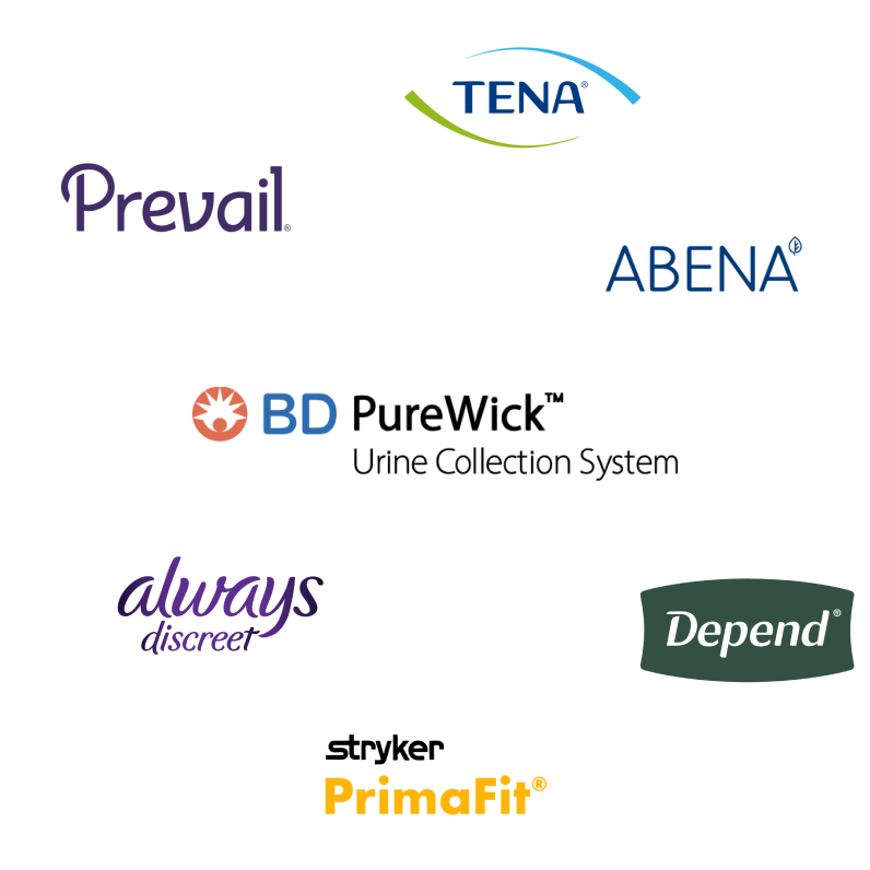
Competitors' digital experiences were transactional and clinical. They provided product information but no guidance for decision-making, and failed to address the emotional barriers to purchase.
💡 Key insight
Some users need extensive education before feeling ready to purchase. Others already know what they want and just need a direct path to buy.
The digital experience needed to serve both: multiple pathways based on user readiness and comfort level.
Approach
Mapping the journey
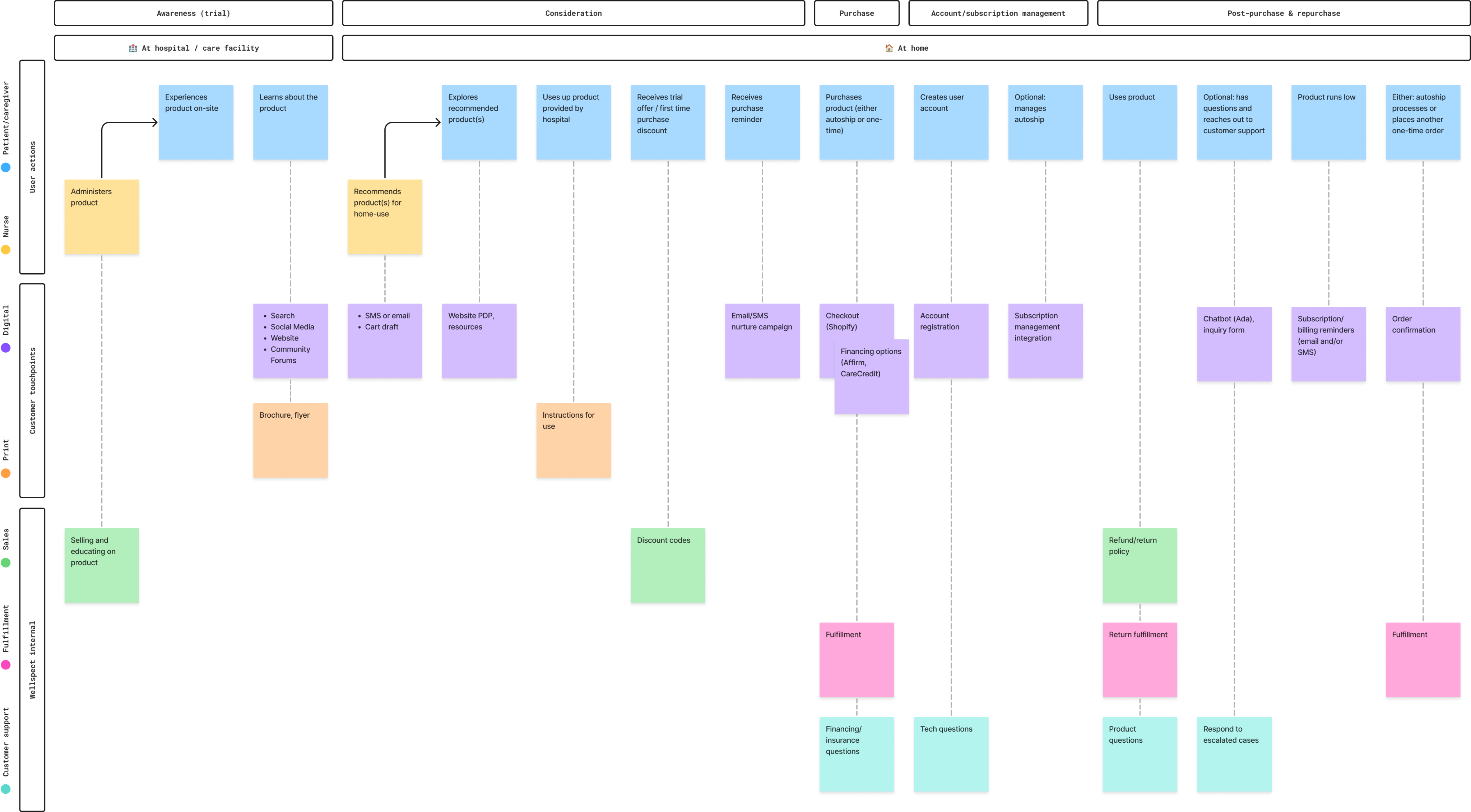
Collaborating with a service designer, I mapped the complete user journey to align the cross-functional team and identify design opportunities across five key stages:
Key stages
1
Awareness: Initial product discovery and in-hospital trial experience
2
Consideration: Learning about the product, exploring recommendations, and evaluating fit
3
Purchase: Trial offers, purchase reminders, and transaction completion
4
Account and subscription management: Account creation, autoship setup and control
5
Post-purchase and repurchase: Product usage, customer support touchpoints, and reorders
This mapping revealed critical touchpoints where design could reduce friction and build trust—from the trial offer as a low-commitment entry point, to the quiz for guided product qualification, to subscription management tools that give users control. With the journey mapped, I translated those stages into site structure through lo-fi wireframes—validating user flows at a page level, determining where the quiz would surface, and how subscription would be positioned as the default without hiding one-time options. Stakeholder reviews at key milestones ensured alignment before moving into visual design.
Accessibility-first approach
With an aging primary audience, accessibility wasn't just compliance—it was core to the product strategy. I approached accessibility as a foundation that would improve the experience for everyone:
1
Legibility first: 16px minimum body text, high contrast ratios (WCAG AA), clear visual hierarchy
2
Forgiving interactions: 44x44px minimum touch targets, large buttons, ample spacing, clear error states
3
Reduced cognitive load: Simple navigation, progressive disclosure of complex information, clear labeling
4
User control over motion: Global play/pause controls for all animations and video content, respecting user preferences and reducing motion sensitivity issues
This approach ensured that users experiencing age-related vision or motor challenges could navigate confidently while creating a cleaner, more usable experience for all visitors.

Conversion strategy
Research showed that some users need extensive education before feeling ready to purchase, while others already know what they want and just need a direct path to buy. I designed multiple conversion pathways based on user awareness and experience level:
1
Low-commitment entry
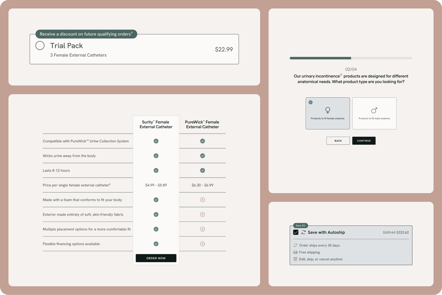
For users exploring options, the 3-catheter trial pack reduced financial and emotional barriers. Research showed this was critical given the stigma and uncertainty around trying a new solution.
2
Guided qualification
For users unsure if the product fits their needs, the quiz provided personalized recommendations and built confidence before purchase. Focus groups revealed that many women weren't sure if their incontinence level warranted an external catheter.
3
High-intent conversion
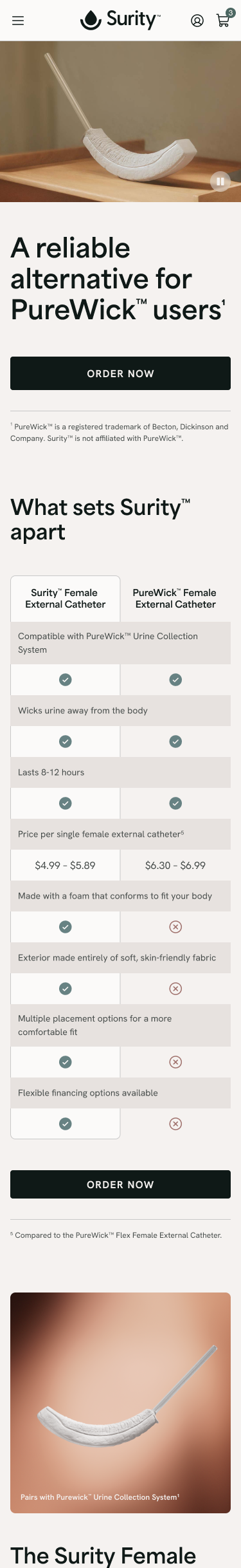
For existing PureWick customers actively searching for products, dedicated landing pages immediately addressed their known pain points—leakage, comfort, difficult cleaning—and streamlined the path to purchase. Research confirmed PureWick users were actively seeking improvements but needed reassurance about pump compatibility.
4
Subscription as default
Positioned subscription as the primary option to establish recurring revenue while offering flexibility to skip, pause, or modify through the portal. Focus groups showed users valued the convenience once trust was established.
Visual differentiation
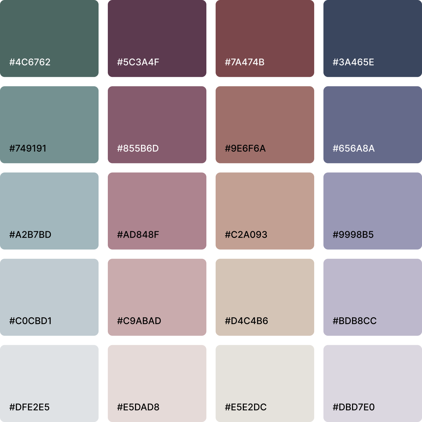
I worked with the creative team to establish a warm, authentic visual identity that broke from category conventions:
1
Color: Natural, warm tones vs. clinical blues dominating the category
2
Photography: Home-centered, authentic moments showing product seamlessly fitting into daily life—not posed, clinical scenarios. Research showed competitors' overly bright, unnaturally cheerful imagery felt inauthentic and one-dimensional.
3
Centering the patient: Focus groups revealed that while caregivers have their own needs (sleep, worry about patient safety), the most effective approach is addressing patient needs first—caregiver needs are inherently met when patient priorities are addressed. This informed our visual storytelling to center on the patient experience while acknowledging the caregiver role.
Design solutions
Website
I designed the website to guide users from awareness to conversion while addressing concerns and breaking through category stigma.
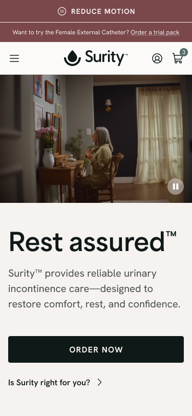
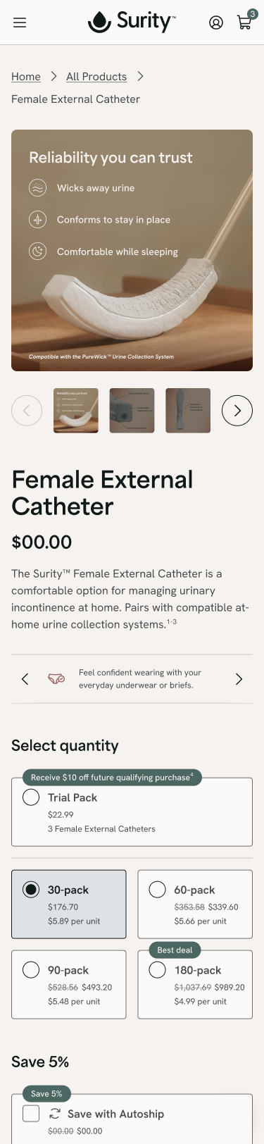
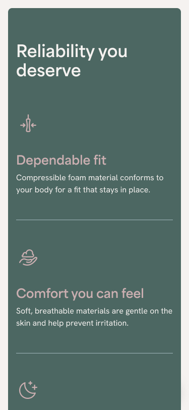
Ecommerce experience
The product pages emphasize subscription as the default purchase model while offering a trial pack for users hesitant to commit. A prominent PureWick compatibility callout addresses the go-to-market reality: we needed to reassure existing users their pump would work with our catheter. A "coming soon" section for the Urinary Management System and Male External Catheter signals the brand's future while capturing early interest.
Quiz tool
A conversational quiz guides users through their incontinence challenges and current solutions without pressure to purchase. Based on their responses, users receive personalized recommendations—either to try the product or consult a healthcare provider. For users whose needs align with future products, a waitlist signup captures intent before launch.
Conversion-focused landing pages
Dedicated pages for high-intent PureWick customers searching for alternatives. Immediate compatibility messaging, side-by-side comparisons, and a single clear call-to-action streamline the path from search to purchase.
Educational content
Resources that normalize external catheters and address common concerns through progressive disclosure—giving users the information they need without overwhelming them.
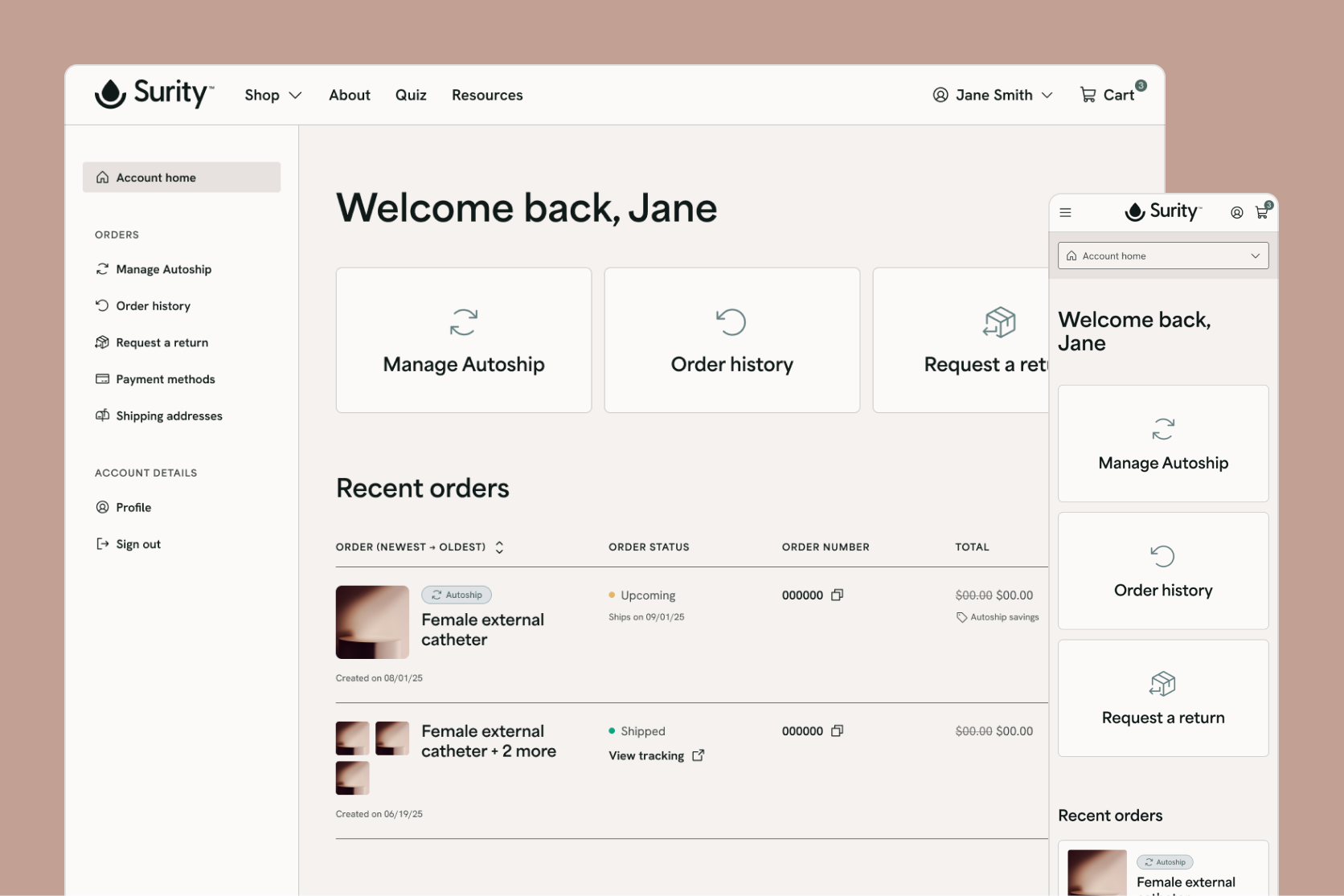
Subscription portal
Users needed simple, clear control over their subscriptions without navigating complex account settings. The portal provides an at-a-glance dashboard showing order status and upcoming deliveries, with large, clearly labeled actions for common tasks—skip, pause, or modify shipments. Proactive notifications keep users informed without requiring them to check in.
Design system
I built a comprehensive design system to ensure consistency across all touchpoints and speed up development. Components are accessibility-first by default, with WCAG compliance built in rather than added later. Reusable patterns for forms, buttons, navigation, and content modules work responsively across mobile, tablet, and desktop.
Outcomes
Surity launched in January 2026 as Wellspect's entry into the external catheter market. The digital ecosystem is now live and supporting the direct-to-consumer launch strategy.
Launch deliverables
1
Complete digital ecosystem delivered on schedule for go-to-market
2
Accessibility-first design system positioning the team for rapid iteration and future product launches
3
Multi-pathway conversion strategy enabling both trial and subscription models from day one
4
Scalable information architecture designed to accommodate expanding product line

Back to all work
All work represents professional projects. Sensitive information and proprietary details have been omitted to respect confidentiality agreements.
© Kelsey Kohlman 2026. All rights reserved.
Kelsey Kohlman
Work
About
Get in touch

Surity
Designing an accessible, human-centered experience that breaks through stigma in urinary incontinence care.
Role
Lead Product Designer
Rest of team
Service Designer | Product Manager | Project Manager | Copywriter | Creative Director | Art Director | Graphic Designer | Engineering
Overview
I designed the complete digital ecosystem for Surity, a DTC urinary incontinence brand launching its Female External Catheter. This included the website (ecommerce, quiz, educational content, conversion-focused landing pages), subscription management portal, and design system.
I led the end-to-end design process—from synthesizing focus group findings and defining the user journey, to creating information architecture and wireframes, leading visual design explorations, and building a comprehensive design system.
The challenge
Millions of women experience urinary incontinence, yet stigma keeps them suffering in silence. One focus group participant captured this:
"So many women my age are starting to have incontinence issues, but it's amazing to me how no one knows about this machine... Incontinence is something that no one wants to talk about because they're embarrassed."
The design challenge: create a brand experience that breaks through shame while meeting practical needs.
Key constraints
1
Incomplete product line: Launching catheter only (no pump until Spring 2026)—required targeting existing PureWick customers
2
Regulatory requirements: Strict medical device regulatory requirements on all claims; copywriter owned the claims matrix and I designed within those constraints
3
Aging audience: Primary users 50+ required accessibility considerations
Discovery
Understanding the users
The primary users are women 50+ experiencing incontinence and their caregivers.
I synthesized findings from a focus group (led by an external partner focused on product positioning) and conducted secondary market research:
Critical pain points
1
Awareness gap: Most women didn't know external catheter solutions existed
2
Decision uncertainty: Women weren't sure if their condition warranted an external catheter
3
Emotional barrier: Embarrassment prevented women from seeking help
Competitive landscape
Competitors' digital experiences were transactional and clinical. They provided product information but no guidance for decision-making, and failed to address the emotional barriers to purchase.
💡 Key insight
Some users need extensive education before feeling ready to purchase. Others already know what they want and just need a direct path to buy.
The digital experience needed to serve both: multiple pathways based on user readiness and comfort level.
Approach
Mapping the journey
Collaborating with a service designer, we mapped the complete user journey to align the cross-functional team and identify design opportunities across five key stages:
Key stages
1
Awareness: Initial product discovery and in-hospital trial experience
2
Consideration: Learning about the product, exploring recommendations, and evaluating fit
3
Purchase: Trial offers, purchase reminders, and transaction completion
4
Account and subscription management: Account creation, autoship setup and control
5
Post-purchase and repurchase: Product usage, customer support touchpoints, and reorders
This mapping revealed critical touchpoints where design could reduce friction and build trust—from the trial offer as a low-commitment entry point, to the quiz for guided product qualification, to subscription management tools that give users control. With the journey mapped, I translated those stages into site structure through lo-fi wireframes—validating user flows at a page level, determining where the quiz would surface, and how subscription would be positioned as the default without hiding one-time options. Stakeholder reviews at key milestones ensured alignment before moving into visual design.
Accessibility-first approach
With an aging primary audience, accessibility wasn't just compliance—it was core to the product strategy. I approached accessibility as a foundation that would improve the experience for everyone:
1
Legibility first: 16px minimum body text, high contrast ratios (WCAG AA), clear visual hierarchy
2
Forgiving interactions: 44x44px minimum touch targets, large buttons, ample spacing, clear error states
3
Reduced cognitive load: Simple navigation, progressive disclosure of complex information, clear labeling
4
User control over motion: Global play/pause controls for all animations and video content, respecting user preferences and reducing motion sensitivity issues
This approach ensured that users experiencing age-related vision or motor challenges could navigate confidently while creating a cleaner, more usable experience for all visitors.

Conversion strategy
Research showed that some users need extensive education before feeling ready to purchase, while others already know what they want and just need a direct path to buy. I designed multiple conversion pathways based on user awareness and experience level:
1
Low-commitment entry
For users exploring options, the 3-catheter trial pack reduced financial and emotional barriers. Research showed this was critical given the stigma and uncertainty around trying a new solution.
2
Guided qualification
For users unsure if the product fits their needs, the quiz provided personalized recommendations and built confidence before purchase. Focus groups revealed that many women weren't sure if their incontinence level warranted an external catheter.
3
High-intent conversion
For existing PureWick customers actively searching for products, dedicated landing pages immediately addressed their known pain points—leakage, comfort, difficult cleaning—and streamlined the path to purchase. Research confirmed PureWick users were actively seeking improvements but needed reassurance about pump compatibility.
4
Subscription as default
Positioned subscription as the primary option to establish recurring revenue while offering flexibility to skip, pause, or modify through the portal. Focus groups showed users valued the convenience once trust was established.
Visual differentiation
I worked with the creative team to establish a warm, authentic visual identity that broke from category conventions:
1
Color: Natural, warm tones vs. clinical blues dominating the category
2
Photography: Home-centered, authentic moments showing product seamlessly fitting into daily life—not posed, clinical scenarios. Research showed competitors' overly bright, unnaturally cheerful imagery felt inauthentic and one-dimensional.
3
Centering the patient: Focus groups revealed that while caregivers have their own needs (sleep, worry about patient safety), the most effective approach is addressing patient needs first—caregiver needs are inherently met when patient priorities are addressed. This informed our visual storytelling to center on the patient experience while acknowledging the caregiver role.
Design solutions
Website
I designed the website to guide users from awareness to conversion while addressing concerns and breaking through category stigma.
Ecommerce experience
The product pages emphasize subscription as the default purchase model while offering a trial pack for users hesitant to commit. A prominent PureWick compatibility callout addresses the go-to-market reality: we needed to reassure existing users their pump would work with our catheter. A "coming soon" section for the Urinary Management System and Male External Catheter signals the brand's future while capturing early interest.
Quiz tool
A conversational quiz guides users through their incontinence challenges and current solutions without pressure to purchase. Based on their responses, users receive personalized recommendations—either to try the product or consult a healthcare provider. For users whose needs align with future products, a waitlist signup captures intent before launch.
Conversion-focused landing pages
Dedicated pages for high-intent PureWick customers searching for alternatives. Immediate compatibility messaging, side-by-side comparisons, and a single clear call-to-action streamline the path from search to purchase.
Educational content
Resources that normalize external catheters and address common concerns through progressive disclosure—giving users the information they need without overwhelming them.
Subscription portal
Users needed simple, clear control over their subscriptions without navigating complex account settings. The portal provides an at-a-glance dashboard showing order status and upcoming deliveries, with large, clearly labeled actions for common tasks—skip, pause, or modify shipments. Proactive notifications keep users informed without requiring them to check in.
Design system
I built a comprehensive design system to ensure consistency across all touchpoints and speed up development. Components are accessibility-first by default, with WCAG compliance built in rather than added later. Reusable patterns for forms, buttons, navigation, and content modules work responsively across mobile, tablet, and desktop.
Outcomes
Surity launched in January 2026 as Wellspect's entry into the external catheter market. The digital ecosystem is now live and supporting the direct-to-consumer launch strategy.
Launch deliverables
1
Complete digital ecosystem delivered on schedule for go-to-market
2
Accessibility-first design system positioning the team for rapid iteration and future product launches
3
Multi-pathway conversion strategy enabling both trial and subscription models from day one
4
Scalable information architecture designed to accommodate expanding product line
Back to all work
All work represents professional projects. Sensitive information and proprietary details have been omitted to respect confidentiality agreements.
© Kelsey Kohlman 2026. All rights reserved.
Overview
Challenge
Discovery
Approach
Design solutions
Outcomes